13th January 2025 - Rachel Tannenbaum
Introducing Vivid Live: Figma Component Library
We're thrilled to announce our new Figma component library – a significant upgrade to our previous design system that takes our Vivid components to the next level. If you've been using our existing library, get ready for a transformative design experience.
Our previous Figma library served us well, but we knew we could do better. This new library isn't just an update – it's a complete reimagination of how design components should work.
Every component is now precisely synchronized with our Vivid API web components. What you design is exactly what developers will implement – eliminating any discrepancies between design and final product.
We've fully embraced the latest Figma token features, providing:
- Seamless dark and light mode implementations
- Consistent color management across design states
- Enhanced design flexibility
We've completely restructured the library to make:
- Component selection more intuitive
- Navigation smoother and more logical
- Design workflow more efficient
Full control through side panel options
- Easily choose component appearances
- Toggle features on and off
- Set multiple component states with a few clicks
- Component description, extra explanation if needed and link to the docs page
Pre-built, interconnected component setups
- Expertly configured component combinations
- Examples include fully-configured select dropdowns with correct options
- Ready-to-use menu components with pre-populated menu items
- Intuitive connections between related components
-
Complete API Synchronization: 100% alignment with Vivid API components
-
Thoroughly Tested: We've gone the extra mile to make sure everything works perfectly (Components QA)
-
Expanded Component Set: New components and enhanced features like:
- Searchable select
- Video-player
- Side-Drawer
- Tabs - vertical tabs, removable tab
-
Flexible Color Systems: Full support for dark and light modes
-
Unparalleled Customization: Granular control over component design
[Vivid Live](https://www.figma.com/design/vDH2AytCxEvOulJ7olf9cS/Vivid Live?node-id=0-1&p=f&t=UZaEYgO1lCigebt5-0) comes with 2 additional assets:
- [Vivid Live Tokens](https://www.figma.com/design/l7PH4EhGm3SXH9FJQBBPZG/Vivid Live-Tokens?node-id=33646-138859&t=AZY0LVVL7Qe15zCI-1)
- [Vivid Live Icons](https://www.figma.com/design/isdKI406usLCxZ2U8ljDrn/Vivid Live-Icons?node-id=274-7267&t=YWWxn3L71PA9Hfuf-1)
Make sure you are adding all 3 of them :)
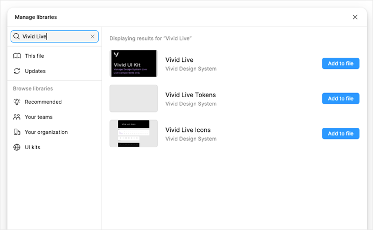
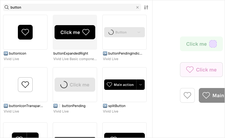
All components are ordered alphabetically.
Choose your component and add it.
Most of the components now are not declared as dark / light and can be configured under figma appearance section to meet your theme:
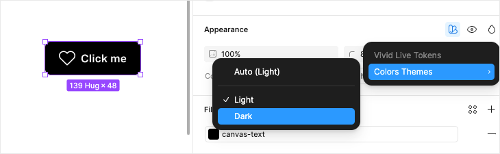
However - when there’s drop-shadow - the tokens are not changing - so you’ll find a component for dark & light.
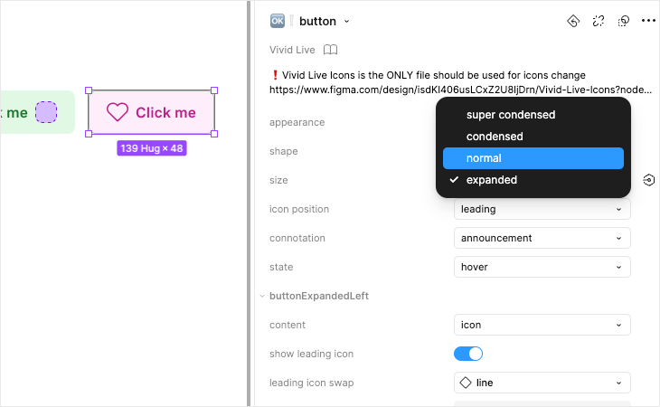
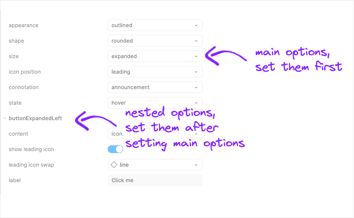
After adding the component - you’ll find all its options in the side panel.
From size to appearance to stats and text customization.
Known issues in customizing components
- We did our best to keep the order of the properties reasonable and intuitive but using inner templates sometimes limited that option.
- We are using inner templates for component variation.
- Variation options are not always in the right order, although we did our best to keep the order of the properties reasonable and intuitive
- Some variations re-sets the component data. Make sure you pick the upper options before other customization.
- In order to simplify and light components and for better maintenance we separated some components to different components. For example:
- Button has lots of variation - button basic, button basic transparent, stacked button and more:
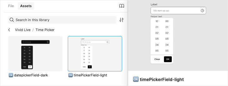
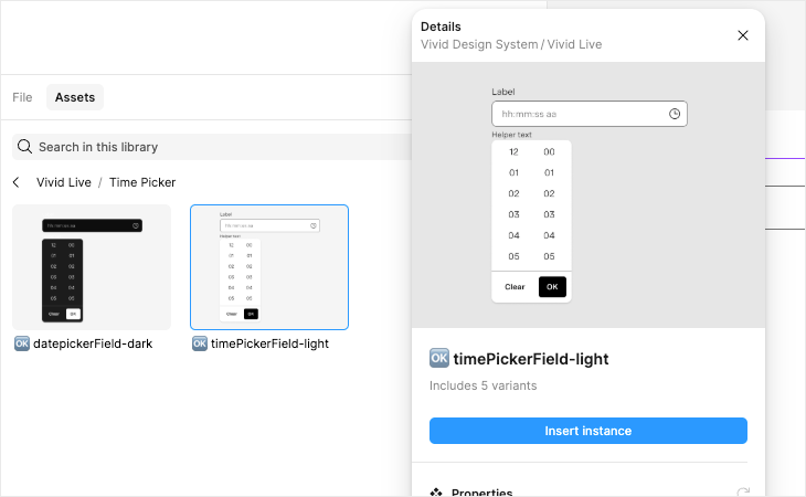
- Time Picker (and same for all components with open drop-downs), we have a component for the input and a component that is composition of the input and a dropdown with the option set that fits for it.
- Button has lots of variation - button basic, button basic transparent, stacked button and more:
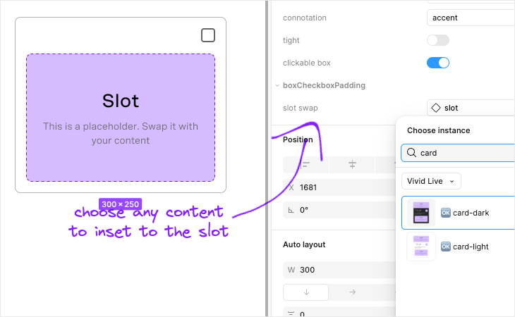
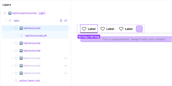
Vivid Live is synced to the API, which means, like the actual components, it uses Slots. For each slot you can either show / hide the slot and swap the default slot with your content.
Components like select, menu, tabs and more have a component that is built with composition. You can configure the composition when entering the layer in the layers panel, you’ll see its options in the right panel.
This library is a living, breathing resource. We're committed to continuous improvement and value your feedback.
Spot something that could be even better?
We want to hear from you!
❤